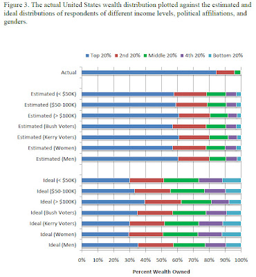
 Source: Building a Better America – One Wealth Quintile at a Time The first graph shows the actual distribution of wealth by quintile in the U.S. versus what various groups think the distribution is... The second shows the distributions in Sweden and The U.S. , along with a theoretical equal distribution... and opinion as to which is the "better" distribution...
The abstract: "Disagreements about the optimal level of wealth inequality underlie policy debates ranging from taxation to welfare. We attempt to insert the desires of “regular” Americans into these debates, by asking a nationally representative online panel to estimate the current distribution of wealth in the United States and to “build a better America” by constructing distributions with their ideal level of inequality. First, respondents dramatically underestimated the current level of wealth inequality. Second, respondents constructed ideal wealth distributions that were far more equitable than even their erroneously low estimates of the actual distribution. Most important from a policy perspective, we observed a surprising level of consensus: All demographic groups – even those not usually associated with wealth redistribution such as Republicans and the wealthy – desired a more equal distribution of wealth than the status quo."
Note: Older data

No comments:
Post a Comment