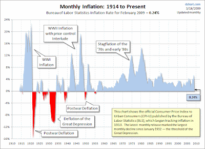
Above, chart showing annual inflation from 1914 through February 2009 (at 0.24%), via
dshort.com
Above, a chart comparing "Bush's deficits" to "Obama's deficits" from
The Heritage Foundation. President Obama's deficits are as scored/projected by the administration and the Congressional Budget Office. Below is 'Comparison of CBO, Administration, and Blue Chip Medium-Term Projections: Levels of Real GDP, 2005 to 2019', which shows that the administration's projections are more positive than both the Congressional Budget Office and the Blue Chip consensus. Chart via
Director's Blog

 Above, graph showing the performance of the Dow during four bear markets, from dshort.com via Calculated Risk...
 Above, a chart comparing "Bush's deficits" to "Obama's deficits" from The Heritage Foundation. President Obama's deficits are as scored/projected by the administration and the Congressional Budget Office. Below is 'Comparison of CBO, Administration, and Blue Chip Medium-Term Projections: Levels of Real GDP, 2005 to 2019', which shows that the administration's projections are more positive than both the Congressional Budget Office and the Blue Chip consensus. Chart via Director's Blog