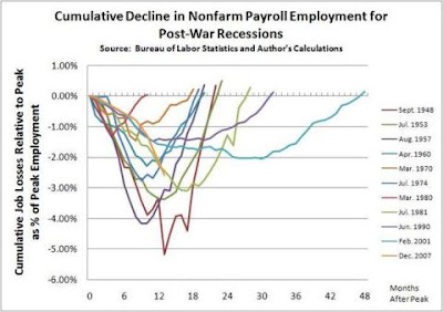

The February 8th Random chart entry showed one released by the Office of the Speaker of the House of Representatives that showed the number of jobs lost following the starts of the current and "recent" recessions. Two better charts are those available here and here. These improve upon the one earlier, by a) showing the job losses as a percent (i.e. taking into account that the workforce now is larger than it was several years ago), and b) providing additional comparison recessions (i.e. not cherrypicking "recent" recessions). Go to those sites to see the charts (the ones above have been shrunk to encourage you to go to the source to see them) and the accompanying discussion/analysis.

No comments:
Post a Comment